How to Style Maximalist Jewelry Without Clashing With Abstract Prints
You love your bold jewelry. The sculptural cuff, the layered charm necklace, the oversized earrings that practically are your personality. You also love expressive prints – swoops of color, painterly patterns, wearable art pieces that feel like movement on fabric. But wearing them together? That’s where the hesitation kicks in.
Can you really pair maximalist jewelry with abstract prints without looking overdone? The answer is yes – but only if you do it right. It’s not about toning either of them down. It’s about giving each element its moment and creating a look that feels full, not chaotic.
It all comes down to balance, scale, and a little strategy. Want to see how expressive art pieces and statement jewelry can work together without competing? Just click here to explore the possibilities.
Start with One Clear Focal Point
Let’s start with the biggest trap: trying to let everything shine all at once. It’s tempting. You’ve got a necklace you love and a printed scarf that makes you feel like an art installation. Why not wear them both? You can – just don’t let them fight for attention.
Choose a primary focus: Is it the print or the jewelry?
If your dress is a swirl of vibrant brushstrokes, opt for a sculptural earring or a single oversized cuff – something bold, but not layered. If your outfit is more neutral or tonal, then go for that layered necklace stack or the chunky wrist party.
One element leads. The other supports.
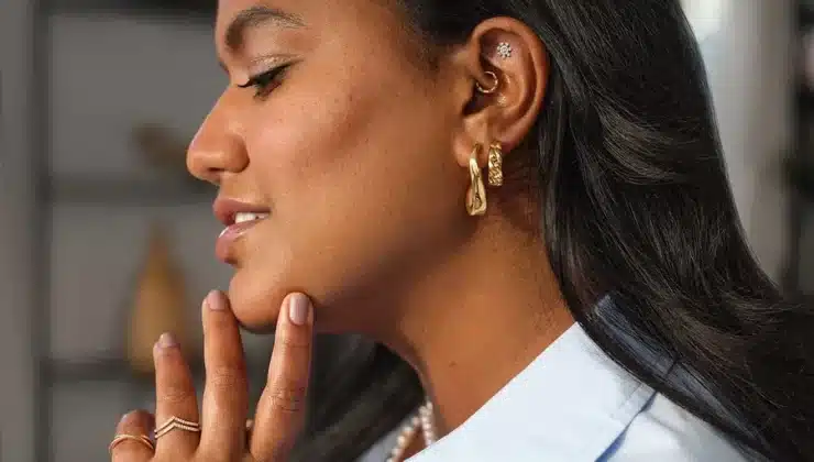
Think in Silhouettes, Not Just Statements
Maximalist jewelry isn’t just about size – it’s about shape. You’ve got jagged chokers, twisted bangles, and earrings that could double as wearable sculptures. But when you’re working with abstract prints, those shapes matter even more.
Soft, flowing prints pair best with fluid forms – think rounded earrings, curved cuffs, or organic drop shapes. The jewelry echoes the movement of the print.
Geometric or linear prints? That’s where you bring in angles – sharp lines, stacked rectangles, layered bars. The match feels intentional, not overwhelming.
It’s like styling your outfit as a composition. If your print is the brushstroke, your jewelry is the frame.
Use Space Like a Stylist
Not every inch of your body needs to carry the visual weight. One of the secrets to mixing bold prints and big accessories is to let space be part of the design.
Try this:
- Printed blouse with a deep neckline → bold earrings, bare neck
- Patterned scarf around the neck → minimalist earrings, sculptural ring
- Art dress with busy sleeves → statement cuff on one wrist, no necklace
Negative space creates visual breathing room. It lets each element stand on its own without becoming noise.
You wouldn’t cram every corner of a painting with detail, right? Same goes for your outfit.
Match Tone, Not Texture
If your jewelry has an antique gold finish, don’t pair it with a super shiny, synthetic-looking print. If your accessories are matte black, steer clear of ultra-glossy silks unless there’s balance elsewhere.
What works best? Echoing tone across different materials.
- A matte brass cuff with a linen dress featuring hand-drawn print
- Polished silver hoops with a silk scarf that has metallic undertones
- Iridescent beading with an abstract dress in deep jewel tones
You’re not trying to match textures – you’re trying to keep the tone of the look consistent. That’s what creates cohesion, even in contrast-heavy styling.
Use Color Intentionally
Color can either make or break a print-jewelry combo. If your outfit is already full of color, you don’t need jewelry that adds more layers of hues. You need contrast, control, and maybe a pop.
Here’s how to make color work in your favor:
- Pull one color from your abstract piece and repeat it in your jewelry – like a blue resin earring that matches a streak in your scarf
- Use gold or silver as a neutral anchor when your outfit already has multiple tones
- Try tonal layering – wear rose gold cuffs with a pink-heavy print for a soft, cohesive feel
- Use bold primary jewelry (like red earrings or a cobalt ring) only if your outfit is grounded in neutrals
The best way to keep it clean? Choose one or two dominant colors per look and let everything else orbit around them.
Stack Smart (Not Just More)
Layering rings, stacking bangles, combining necklaces – it’s a maximalist signature. But when prints enter the picture, stacking has to be strategic.
If your blouse has long sleeves and busy cuffs, don’t overload your wrists. Go for stacked rings instead. If your dress has a low neckline, that’s your opportunity to layer chain after chain – just skip the chunky earrings in that case.
And consider varying your scale when stacking:
- One thick bangle + two thin ones
- A short choker + mid-length pendant + long, delicate chain
- Several slim rings with one bold cocktail piece
That shift in scale keeps it from looking like costume jewelry, even when you’re wearing half your collection at once.
Pair Metals With Mood
Gold feels warm and grounded. Silver feels sleek and modern. Rose gold gives off softness. Brass reads as artisanal and earthy. Your metals carry emotional weight – use them to shape the vibe of your look.
Pair gold with rich, painterly prints in jewel tones
Use silver with abstract pieces in icy or high-contrast palettes
Go for brass or copper with earthier tones and organic patterns
Use mixed metals if your print has a lot of movement – it mirrors that energy
And if you’re working with expressive, layered prints? Sometimes simplicity wins. A bold print scarf paired with one brushed silver cuff is enough to make a statement without saying too much.
Let Your Prints Inform Your Placement
Not every necklace needs to sit at the centre of your chest. Not every earring needs to be symmetrical. Abstract prints are fluid by nature – let that guide where your jewelry lives.
Try:
- A single statement earring on the opposite side of your scarf knot
- A bold ring on your index finger instead of your usual stacking combo
- A pin or brooch layered onto your abstract-printed jacket or scarf
This kind of placement makes the jewelry feel integrated – not just added on top.
You’re not decorating a look – you’re completing it.
Know When to Stop (But Don’t Be Scared to Start)
There’s no formula for how many accessories is “too many.” It’s all about intention.
If every piece you’re wearing tells a part of the same story – go for it. But if one element feels random, like it doesn’t belong, pull it back. Edit like an artist. Every detail matters.
Try doing a full look, then standing in front of the mirror and removing one thing. You’ll often find that the outfit lands better with just a touch less.
But on the flip side? Don’t shy away from bold jewelry just because you’re wearing print. These two elements are meant to go together. When done well, it’s what makes a look unforgettable.
So layer that cuff. Stack those chains. Clip on the earring that feels just a little too big. With the right print, the right balance, and the right confidence – it all works, according to UStyle Magazine.