How to Choose the Perfect Shade of White for Your Cabinets
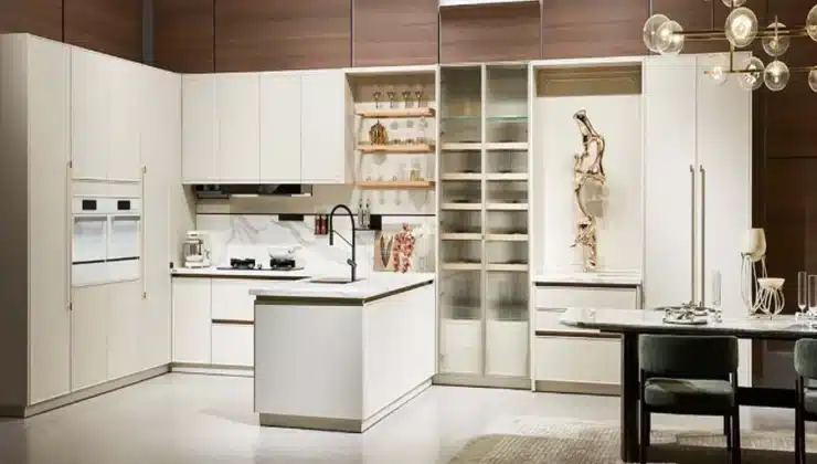
White cabinets never seem to go out of style. Seriously, in my 15 years as a designer, I’ve watched trends come and go, but white kitchens maintain their appeal through it all. That said, asking for “white cabinets” is like asking for “cheese” at a fancy deli—you need to be way more specific! There are literally hundreds of white shades out there, and choosing between them can make or break your kitchen design.
Why White Gets Complicated
Here’s the thing about white: it’s never just white. Stand in any kitchen showroom with a decent lighting setup, and you’ll immediately see how different one white cabinet looks from another. What looks crisp and clean in the store might read as sterile and cold in your home, or a warm white that felt cozy in the sample might suddenly look yellowish under your kitchen lights.
White paint and finishes reflect surrounding colors, which means your flooring, countertops, backsplash, and even that bright red KitchenAid mixer will influence how the white appears. Even the direction your kitchen faces matters—north-facing rooms receive cooler light, while south-facing rooms get warmer, golden light throughout the day.
Understanding White Undertones
The secret to choosing the right white lies in understanding undertones. Most whites fall into these basic categories:
Pure Whites: These have minimal undertones and appear crisp and clean. They’re the “true whites” like Benjamin Moore’s Chantilly Lace or Sherwin Williams’ Extra White.
Warm Whites: These contain yellow, red, or brown undertones, creating a soft, inviting feel. Think creamy whites like Benjamin Moore’s Swiss Coffee or Sherwin Williams’ Alabaster.
Cool Whites: These have blue, green, or gray undertones, creating a fresh, contemporary look. Benjamin Moore’s Decorator’s White or Sherwin Williams’ Snowbound are popular examples.
I find that most design disasters happen when undertones clash. That creamy white cabinet looks amazing with your warm marble countertop but could look dingy next to a cool white subway tile backsplash. Yikes.
Factors That Should Guide Your White Selection
1. Your Home’s Natural Light
The amount and quality of natural light in your space dramatically affects how white appears.
North-facing kitchens receive cooler, bluish light. Warm whites often work best here to counterbalance the coolness.
South-facing kitchens receive warm, yellowish light throughout the day. You can get away with cooler whites since the natural light will warm them up.
East/West-facing kitchens have changing light throughout the day. This can be tricky! East gets warm morning light and cool afternoon light, while west is the opposite. Consider when you use your kitchen most and prioritize that time of day when testing samples.
2. Your Existing Elements and Overall Style
If you’re not gutting the entire kitchen, you need to consider existing elements:
Flooring: Dark hardwood can make warm whites look yellowy by comparison. Cool whites often pair better with gray-toned or dark floors.
Countertops: White kitchens with marble or quartz countertops need careful coordination. Bring your counter samples when selecting cabinet colors.
Appliances: Stark white cabinets can make older appliances look dingy. If you’re keeping existing appliances, choose a white that complements their color.
The overall style matters too. Traditional kitchens often benefit from warmer whites that feel established and timeless, while contemporary spaces can handle brighter, crisper whites. Last year, I worked on a modern farmhouse kitchen where we specifically chose a white with the slightest hint of gray to keep the space from feeling too precious or country-cute. That subtle undertone made all the difference.
3. Regional Differences and Cultural Factors
This doesn’t get talked about enough, but regional light varies dramatically. The quality of light in Southern California is nothing like the light in Seattle or New York. This is why many Italian kitchen brands offer slightly different whites for different markets. If you’re looking at design inspiration from another region or country, remember that the same white might look different in your home.
Cultural factors matter too. Northern European design tends to embrace cooler, bluer whites that maximize light during long, dark winters. Mediterranean design favors warmer, creamier whites that complement terracotta and warm wood tones.
How to Actually Choose: A Practical Approach
Here’s my tried-and-true method for selecting the perfect white:
Step 1: Narrow Down by Undertone
Look at your fixed elements (flooring, countertops) and determine what undertone would complement them. Start with 3-5 white options in that undertone family.
Step 2: Get Samples (The Right Kind)
Paint samples on large poster boards (at least 2’×2’), or if you’re ordering cabinets, get actual door samples—those tiny color chips are useless! By the way, many cabinet companies charge for samples, but it’s money well spent.
Step 3: Test in Your Space, Not the Store
That gorgeous white in the glossy showroom can look completely different under your kitchen lights. Place your samples in different parts of the kitchen and observe them:
- During different times of day
- With lights on and off
- Against your countertop material
- Near your flooring
- Next to any existing cabinetry or trim
Take photos too! Sometimes the camera catches undertones your eye might miss.
Step 4: Live With It Before Committing
Leave the samples up for at least 48 hours. A white that looked perfect at noon might look off-putting at dinner time when you actually use the kitchen most.
Common White Cabinet Pitfalls to Avoid
Going too bright: Stark, bright whites look amazing in magazines but can be harsh and clinical in real homes. Unless your kitchen gets tons of natural light or you’re going for an ultra-modern look, slightly softened whites are usually more livable.
Matching whites exactly: Your cabinets, trim, and walls don’t need to be identical whites. In fact, slight variation often looks more sophisticated.
Ignoring the finish: The same white will look different in matte, satin, or high gloss. Generally, higher gloss finishes make whites appear brighter and make undertones more noticeable.
Forgetting about maintenance: Bright whites show every fingerprint and speck of dust. If you have small kids or hate cleaning, consider slightly warmer whites or textures that disguise smudges better.
Making Final Decisions
I’m not gonna lie—sometimes after all this analysis, it comes down to gut feeling. I once had a client who tested seven different whites, and ultimately chose based on which sample made her smile when she walked into the room. That kitchen still looks gorgeous eight years later.
If you’re torn between two similar options, go with the slightly warmer one. In my experience, it’s easier to live with a slightly warm white than one that’s too cold.
Remember that lighting can be adjusted. If your perfect white looks a little off once installed, changing your light bulbs from cool to warm (or vice versa) can make a significant difference without replacing cabinets.
The perfect white for your cabinets isn’t about following trends or copying your neighbor’s kitchen. It’s about finding the shade that works with your specific space, light, and style. Take your time, test thoroughly, and trust your eyes. After all, you’re the one who’ll be looking at those cabinets every single day.